

Flex Box is a one-dimensional layout method for arranging items in rows or columns. The Flex Box Module, usually referred to as flex Box, was designed as a one-dimensional layout model, and as a method that could offer space distribution between items in an interface and powerful alignment capabilities.
Flex Box distributed spaces among items to control their alignment structure.
The Flex Model
when elements are laid out as Flex items, they are laid out along two axes.
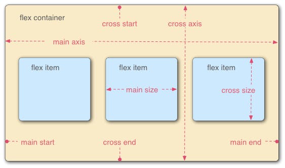
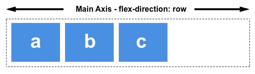
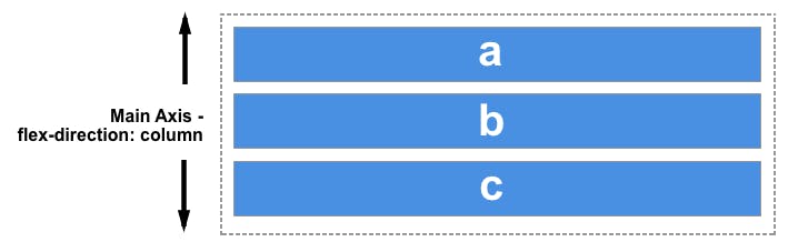
The main axis is the axis running in the direction the flex items are laid out in. The start and end of this axis are called the main start and main end.
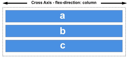
The cross axis is the axis running perpendicular to the direction the flex items are laid out in. The start and end of this axis are called the cross start and cross end.
The parent element that has the
display: flexset on it is called the flex container.The items laid out as flexible boxes inside the flex container are called flex items
The two axes of flexbox
When working with flexbox you need to think in terms of two axes - the main axis and the cross axis. the main axis is defined by the flex-direction property, and the cross-axis runs perpendicular to it. Everything we do with flexbox refers back to these axes, so it is worth understanding how they work from the outset.
The main axis
the main axis is defined by flex-direction which has four possible values-
rowrow-reversecolumncolumn-reverse