

Media Queries in HTML & CSS for Responsive Web Design.
Introduction
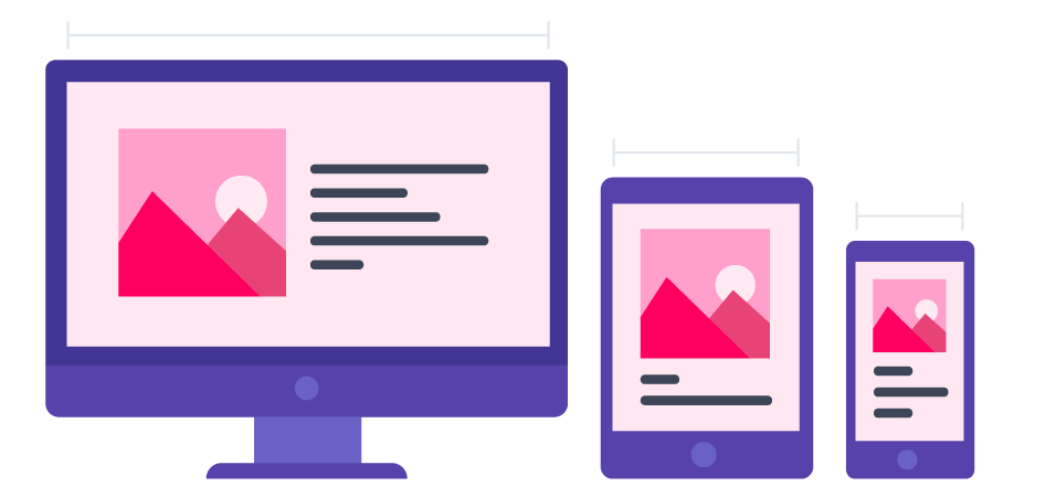
In today's digital world, where websites are accessed on various devices, it's crucial to ensure that your web design remains responsive and accessible across different screen sizes. Media queries in HTML and CSS play a major role in achieving this goal.
Media queries are CSS features that allow developers to apply different styles to elements based on the characteristics of the user's device. This characteristics typically include screen width, height, resolution and even the device's orientation (Landscape or Portrait ). By leveraging media queries, youu can adjust your website's layout and appearace to provide an optimal viewing experience on everything from desktop computers to smartphones and tablets.
Syntax
Media queries are specified using the @media rule in CSS. The basic syntax is as follows:
@media media_type and (media_feature) {
  /* CSS rules to apply when the media feature conditions are met */
}
Media types - define the broad category of the device for which the media quety applies -
all,print,screen. The type is optional (assumed to be all ) except when using thenotoronlylogical operators.Media features - describe a specific characteristic of the user agent, output device or environment.
any-hoverany-pointeraspect-ratiocolorcolor-gamutcolor-indexdevice-aspect-ratiogridheighthover
Adjusting Layout with width Media
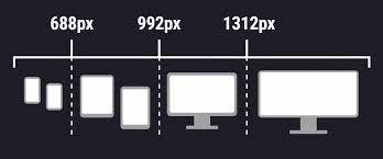
One common use of media queries is to adapt the layout based on the screen width. for instance, you might want to switch from a multi column layout on larger screens to a single column layout on smaller screens.
exa.
/* Default styles for all screen sizes */
.container {
  width: 100%;
  max-width: 1200px;
  margin: 0 auto;
}

/* Media query for smaller screens */
@media screen and (max-width: 768px) {
  .container {
    max-width: 100%;
    padding: 10px;
  }
}
Modifying Styles with Device Orientation
Target the device orientation using media queries to deliver a tailored experience. for instance, make adjustments when the user switches between landscape and portrait modes.
 /* Default styles for both orientations */
 .image-container {
   width: 50%;
   float: left;
 }

 /* Media query for landscape orientation */
 @media screen and (orientation: landscape) {
   .image-container {
     width: 70%;
   }
 }
Mastering media queries is essential for any web developer striving to create responsive and visually appealing websites. By understanding the syntax, best practices we can adapt website's layout and design to various devices with the knowledge gained from this blog.